A homepage that converts visitors into customers is one of the highest leverage assets a startup can have.
Once your website can convert cold traffic, you can spend more time and resources on acquiring new audiences.
This post is going to tear down the homepage of Customer.io, a marketing automation platform that lets marketers design and execute customized campaigns. Customer.io has thousands of customers ranging from large enterprise customers to startups.
This teardown covers all the key sections of a landing page so that you can apply the conversion and copywriting strategies to your startup’s homepage.
Capture the reader’s attention right away
When writing copy for the features section, you typically want to emphasize the problem your audience is facing.
The first thing a new visitor to your site sees is the section called above the fold (ATF). This section is critical because your visitor will decide whether to continue and scroll or bounce based on how useful your ATF is.
Customer.io’s ATF section has five pieces that we’ll dive into individually: header, subheader, call to action, social proof and a visual.
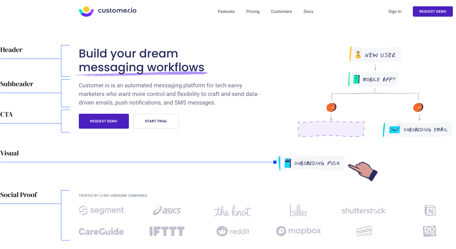
Image Credits: Demand Curve
A strong header that answers “why”
The header of your ATF section should explain exactly what your startup does and why it’s important in a concise way.
A general framework for writing a good header: If a visitor reads only your header, they should still know who you are and why they should use your product.
Help TechCrunch find the best growth marketers for startups.
Provide a recommendation in this quick survey and we’ll share the results with everybody.
Customer.io explains what their product is in two words: messaging workflows. The benefit of using Customer.io is that it enables users to build their dream workflows, which implies complete customizability.
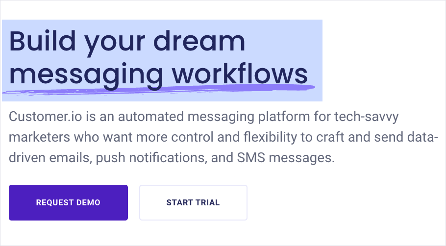
Image Credits: Demand Curve
A subhead that goes deeper
The subhead explains how you’ll accomplish the promise of the header. Customer.io tells users that their automated messaging platform is how they let them build their own workflows.
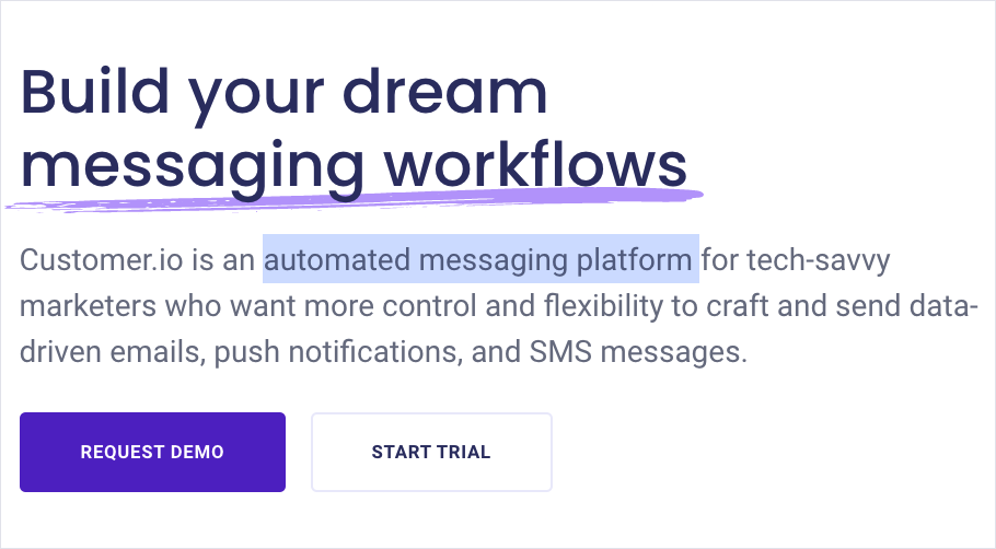
Image Credits: Demand Curve
Subheads can also work by bluntly calling out who the product is for. Customer.io specifies who their product is for clearly. Users will now think, “Do I consider myself a tech savvy marketer?” If yes, they will continue reading. If no, they will bounce, which is completely fine.
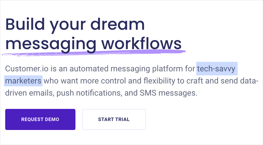
Image Credits: Demand Curve
Customer.io finishes their subhead with the main benefit it offers: Users make more money from their customers because they are able to understand them better through data-driven messaging.
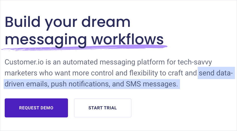
Image Credits: Demand Curve
How to write a high-converting call to action
Calls to action (CTAs) are used to encourage visitors to engage with your site to further the relationship. It’s very difficult to convert a visitor into a customer without some type of action mechanism.
Often, you only want one CTA in your ATF section so that users only have one path to take. But if, for example, you have a demo request CTA and you notice not many people are signing up for it, adding a secondary CTA, such as a free trial, may be worth testing. Customer.io does exactly this because they likely know they’d miss a ton of potential customers without a free trial.
Although they give users multiple options, it’s clear they want users to request a demo because that’s the emphasized CTA. They probably know that users who get a full demonstration are more likely to be converted and retained.
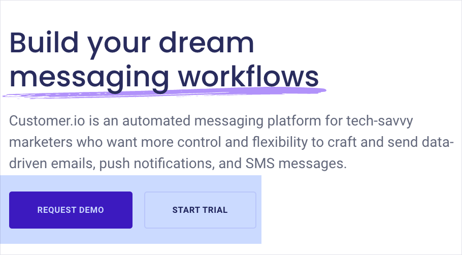
Image Credits: Demand Curve
Adding visuals to explain another way
Including a visual in your ATF section is only a good idea if it helps visitors understand the unique value of your product. Most cartoon explainers or stock images you see on company landing pages are arbitrary and meaningless.
That’s not to say you should stop using drawn visuals. Instead, use visuals to show your product’s value. Customer.io’s visual works because they visualize how the workflow uses time to delay a push notification.
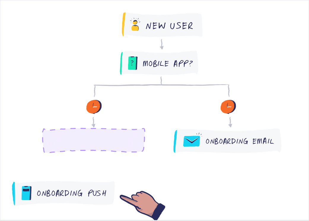
Image Credits: Demand Curve
Add social proof to build credibility
Social proof is crucial for establishing credibility. It’s also used to make visitors feel like everyone already knows about the product and they’re the ones missing out. Customer.io establishes credibility and bypasses any suspicion by saying 3,400 companies already work with them. They further prove their point by showing the logos of their most recognizable customers.
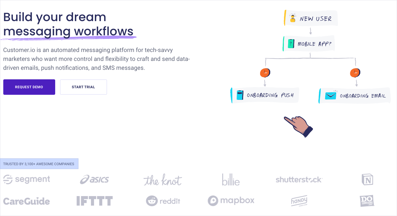
Image Credits: Demand Curve
Describe the features that make your product unique
The features section will make up the bulk of your landing page. Features help users understand why your product is valuable to them. At the same time, it should address any concerns and handle objections proactively.
When writing copy for the features section, you typically want to emphasize the problem your audience is facing. This can be done by repeating the language you hear your customers using to describe their pain points.
Customer.io’s audience of tech-savvy marketers has a burning problem that doesn’t need to be further hyped by the copy. Instead, they focus on showing users how much better their life will be with their product.
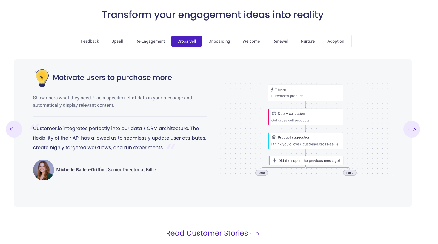
Image Credits: Demand Curve
If you have a lot going on in one section, try using a contrasting visuals to guide the eye. Customer.io uses a yellow light bulb so that users naturally read from title to paragraph to image to social proof.
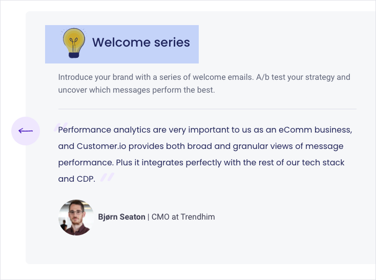
Image Credits: Demand Curve
Adding social proof to feature sections can make the claims feel more credible. Look at how Customer.io uses legitimate marketers to motivate users to look through the tabbed widgets. People, especially in the same profession, tend to look at and accept the decisions of others as correct.
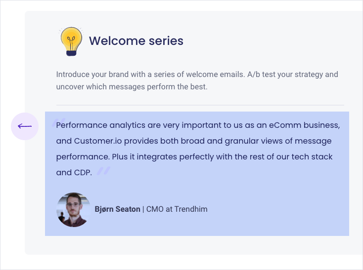
Image Credits: Demand Curve
If users aren’t interacting with your widgets, experiment with multiple navigation options like tabs and arrows.
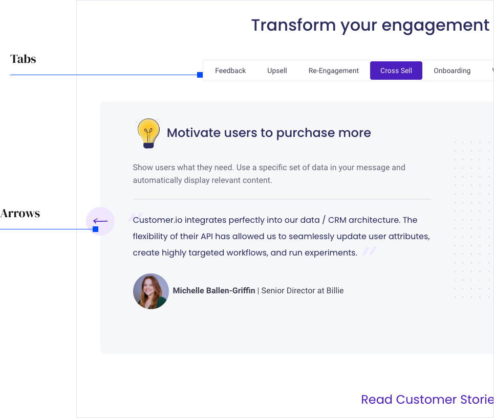
Image Credits: Demand Curve
Secondary features to give prospects peace of mind
As visitors are scrolling through your landing page, it’s possible they can get fatigued by the time they’re halfway through reading. To make things easier, highlight the important parts of each feature. Customer.io highlights all the moving parts of an advanced messaging workflow to give users a dopamine hit: “Can they can really do all of this?”
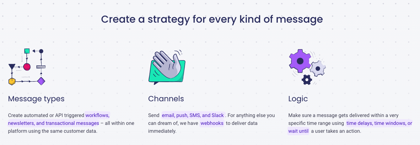
Image Credits: Demand Curve
Highlight a feature by describing how it applies to the reader
Your feature copy should be continuously laced with benefits. Another way to accomplish the same outcome is by addressing objections your customer might have right away. This will have the same effect by giving your reader a sense of your trustworthiness and appealing to their logic.
For Customer.io, the level of customizability is great until the user’s logic brain kicks in and they think: “Wait, I’ve tried setting something like this up in the past, and it never worked.” Customer.io hedges this by showing the technical specifics.
They also emphasize “Just a few clicks,” suggesting it’s easy to use and takes little time to set up.
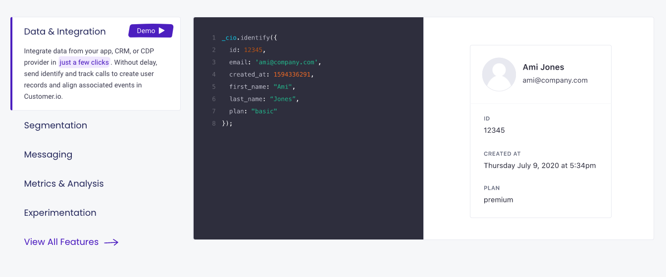
Image Credits: Demand Curve
The visual for the segmentation feature implies users will see more engaged customers when using their product.
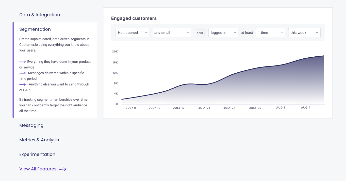
Image Credits: Demand Curve
How to handle objections in your homepage copy
Marketers know how nerve-wracking it can be to send an email campaign to thousands of people. Customer.io brings attention to this pain point and immediately handles it by highlighting their tech support teams and services.
A user might also think, “I don’t want my emails to bounce or end up in spam. I’m not sure I want to risk using a service like this.” That is why Customer.io ensures user emails get analyzed for maximum deliverability.
Some users understandably feel anxious about giving their data to a random “.io tech company.” To prove trust, Customer.io guarantees data protection.
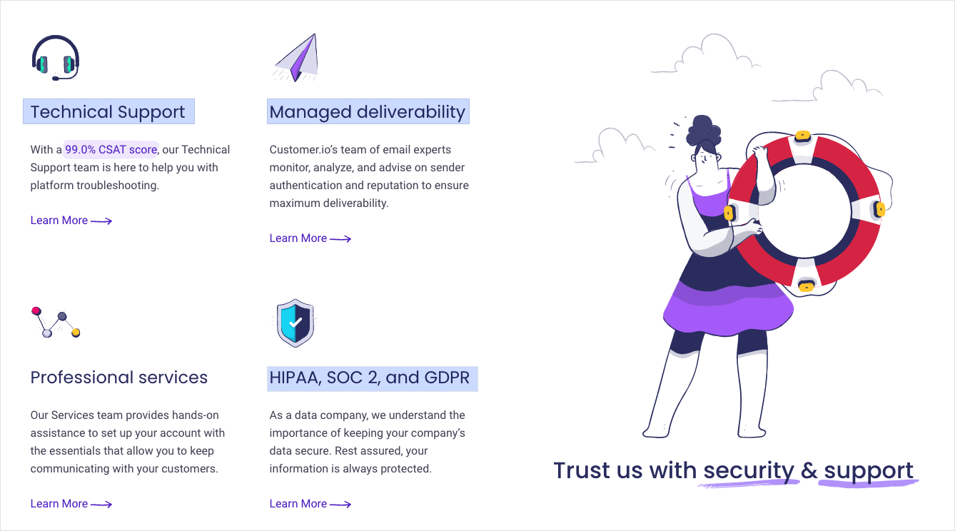
Image Credits: Demand Curve
How to establish credibility in your industry
Using statistics can quickly establish credibility. If you come out and say you’ve sent 535 million webhooks last year, that implies you’re working with a lot of companies and those companies are using your product.
It’s also easier to explain the volume of data you’re able to handle visually than it is through a paragraph of text.

Image Credits: Demand Curve
Finish your page off with a final CTA and more social proof
The last few sections of the landing page are about privacy, security and trust for a reason. Customer.io knows that no amount of painkilling features will win a user over without establishing trust. This is why they make sure to end the copy with a statement about how many companies trust them and include another company wall to the right of the CTA. It reminds visitors how credible they are.

Image Credits: Demand Curve
How to apply this teardown to your homepage
To summarize, here are the key points you should take away from this teardown:
- Tell users exactly who the product is for. This will make your target persona read more closely and send away those who wouldn’t purchase anyway.
- If your main CTA is a demo request and you’re not getting many conversions, experiment with offering a free trial as an additional CTA.
- The style of an image doesn’t matter. What matters is if it helps users understand the value of your product.
- If your product is a painkiller, you don’t need to twist the knife further. Just match the emotions of your audience and show them your solution to their problems.
- If your product targets a specific profession, use testimonials from people in the same profession and make sure to include the company name and job title.
- If you find users don’t navigate through your tabbed widgets, experiment with multiple forms of navigation.
- If your product’s biggest objection is security and trust, it’s okay to go overboard on objection handling.

