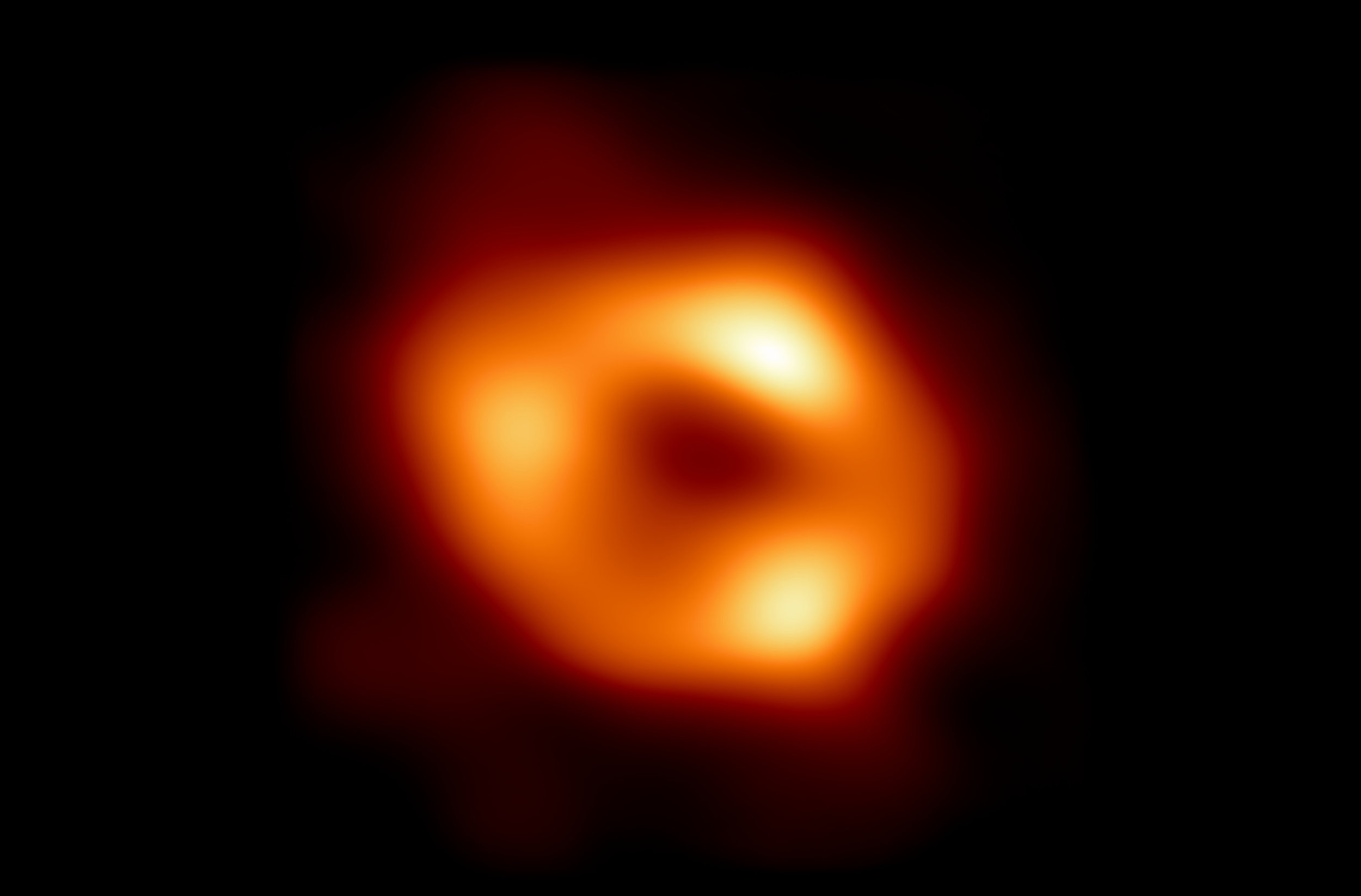
As countless science and general news outlets have reported today, the image of Sagittarius A*, the supermassive black hole at the center of our galaxy, is a fabulous scientific achievement. But one aspect that hasn’t gotten quite as much attention is the central role played by simulations and synthetic data in the discovery.
If you haven’t read about this awesome science news yet, the Event Horizon Telescope’s own post is a great place to get the gist. Based on years of observations from around the globe, a huge team at over a hundred institutions managed to assemble an image of the black hole around which our galaxy rotates, despite its relative closeness and the interference from light-years worth of dust, nebulae and other vagaries of the void.
But this wasn’t just a matter of pointing the telescope in the right direction at the right time. Black holes can’t be observed directly using something like the Hubble or even the still-warming-up Webb. Instead, all kinds of other direct and indirect measurements of the object must be made — how radiation and gravity bend around it and so on.
This means data from dozens of sources must be assembled and reconciled, itself an enormous task and a big part of why observations made in 2017 are only now being published as a final image, which you can see below. But because this project really has no precedent (even the famous M87* image, though superficially similar, used different processes) it was necessary to essentially test multiple possibilities for how the same observations might have been made.
For instance, if it’s “dark” in the middle, is it because there’s something in the way (and there is — about half the galaxy) or because the hole itself has a hole (and it seems to)? The lack of direct observational data makes it hard to say. (Note that the images here don’t simply show an image based on visible light, but the inferred shape based on countless readings of radiation and other measures.)

Image Credits: EHT
Think about viewing an ordinary object from a distance. From straight on it looks like a circle — but does that mean it’s a ball? A plate? A cylinder viewed end on? Here on Earth you might move your head or take a few steps to the side to get a little more info — but try doing that on a cosmic scale! To get effective parallax on a black hole 27,000 light-years away, you’d need to go quite a distance and probably break the laws of physics in the process. So the researchers needed to use other methods to determine what shapes and phenomena best explained what little the could observe.
To systematically explore and evaluate the imaging algorithms’ design choices and their effects on the resulting image reconstructions, we generated a series of synthetic data sets. The synthetic data were carefully constructed to match properties of Sgr A* EHT measurements. The use of synthetic data enables quantitative evaluation of image reconstruction by comparison to the known ground truth. This in turn enables evaluation of the design choices and imaging algorithms’ performance.
In other words, they generated oceans of data relating to different possible explanations for their observations and looked at how predictive these simulated black hole environments were.
Lisa Medeiros from the Institute for Advanced Study, in a very interesting Q&A worth watching in its entirety if you have the time, explained a bit of this in regard to how and why the study looked at the spin of the black hole and how that related to the spin of materials around it and to the galaxy at large.
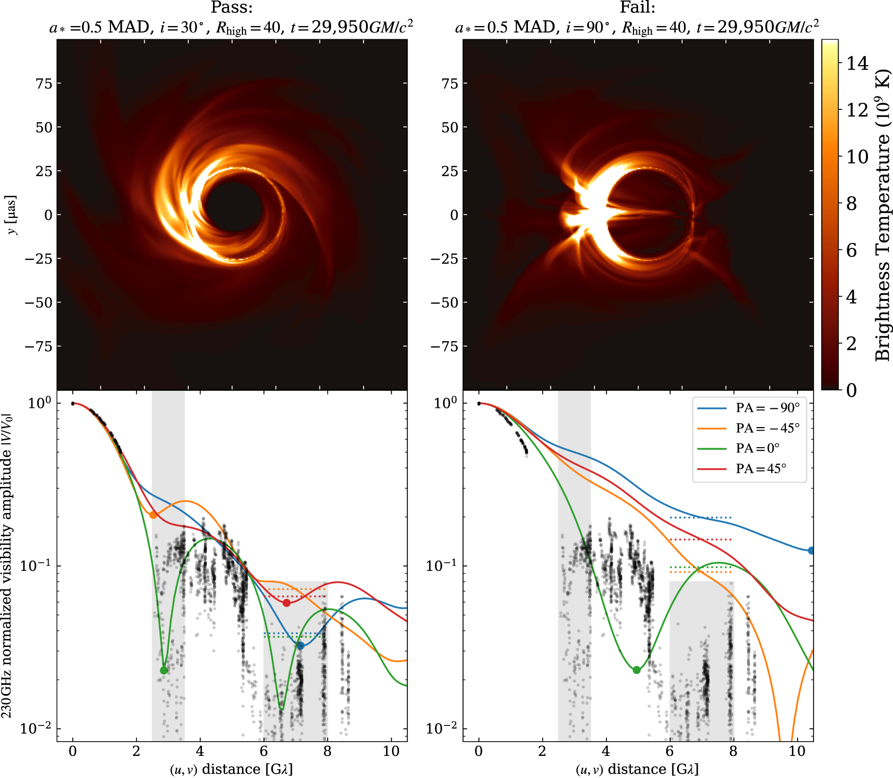
“What was really exciting about this new result, compared to what we did in 2019 for M87, was in paper 5 we actually include several simulations where we explore that [i.e., the spin relationships],” she said. “So, there are simulations where the spin axis of the black hole is not aligned with the spin axis of the matter that is swirling around the black hole, and this is a really new and exciting simulation that was not included in the 2019 publications.”

Image Credits: EHT
Naturally these simulations are unbelievably complicated things that require supercomputers to process, and there’s an art and a science to figuring out how many make sense to do, and how close together they should be. In this case the alignment question being looked at is of inherent scientific value but could also help interpret, for example, the interference caused by gases and dust swirling around the black hole. If the spin is like this, its gravity would affect the dust like this, meaning the readings should be read like this.
“Our simulations, when we look at the simulations compared with the data, we tend to prefer models that are almost pointed at us — not pointed directly at us but off by about 30 degrees or so,” Medeiros continued. “And that would indicate that the spin axis of the black hole is not aligned with the spin axis of the galaxy as a whole, and if you believe what I said earlier, the disk does prefer to be aligned with the spin axis of the black hole. It does seem like the disk and black hole are aligned, but that neither are aligned with the galaxy.”
In addition to going after specific aspects like this, there was the more general question of what shape (or “underlying source morphology”) would produce the readings they got: essentially the “ball versus plate” question, but way, way more complicated.
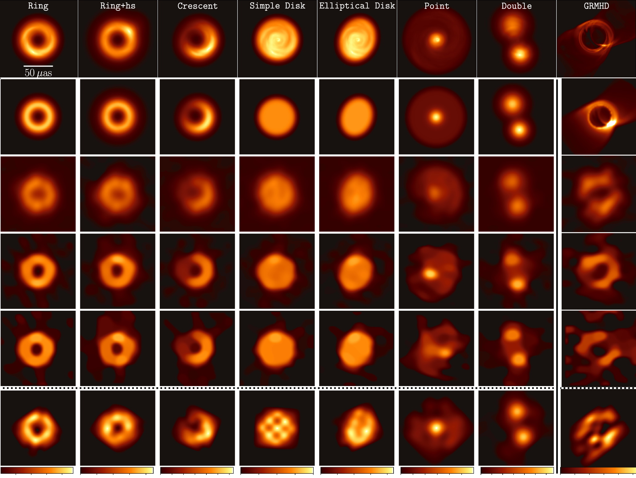
In one of the papers released today, the team describes building seven different potential morphologies for the black hole, reflecting different arrangements of its matter, from ring to disc and even a sort of binary black hole — why not, right? They simulated how these different shapes would produce different results in their instruments and compared those with a more computationally (and linguistically) demanding “General relativistic Magnetohydrodynamic” or GRMHD simulation.
You can see those in a combination of two images from the paper here:

Image Credits: EHT
The idea was to find which of the simulations produced results most like those they actually saw, and while there was no runaway winner, the ring and GRMHD sims (which it must be said were rather ringlike — produced the most consistent results.) This informed the way the data was interpreted for the final interpretation of the data and resultant image. (Note that I am broadly summarizing a wildly complex process here.)
Considering these observations were made some five years ago and much has happened since then, there’s still plenty to investigate and more simulations to run. But they had to hit “print” at some point and the image at top is their most informed interpretation of the data produced. As observations and simulations stack up we can no doubt expect even better ones.
In fact, as the University of Texas, San Antonio’s Richard Anantua put it at the Q&A session, you might even give it a shot yourself.
“If you’re in sixth grade, and you can get access to some of your school’s computers, I think there’s EHT imaging, and we have all sorts of pipelines and tools that you can teach your class,” he said, seemingly only half-joking. “The data for some of this is public — so you can start working on this now and by the time you’re in college, you pretty much have an image.”

