We posted a pair of Apple Watch reviews this time last week. Both the Series 8 and second gen SE received high marks for their categories — flagship and budget, respectively. Were Apple to stick to those two products, it’s easy to imagine the company maintaining roughly a third of the smartwatch market share it currently controls.
After several years of relative stasis, however, the category appears destined for a shakeup, as the number two manufacturer, Samsung (which currently controls roughly 10% of the market), has again embraced wearOS in a bid to expand its reach. We’re also mere weeks away from Google’s long-awaited entry into the category, with the launch of the Pixel Watch fueled — in part — by its Fitbit acquisition.
While those firms were zigging, Apple zagged.
Earlier this month, the company added another key SKU to the Watch line. Announced alongside the Series 8 and SE, the Apple Watch Ultra quickly took the wind out of those products’ sails — and, for that matter, the iPhone — becoming the most talked about piece of hardware announced at the Far Out event in Cupertino. The bigger, bolder take on the smartwatch line finds Apple going after another company entirely.
Ahem, Garmin. For years, it’s had quiet success in the category. But if you know, you know.
The device maker pulled off a rare successful consumer electronics pivot. As the adoption of standalone GPS systems was utterly gutted by the iPhone and its ilk, Garmin jumped into the world of sports focused-fitness trackers. Getting back to that market study, it most recently grabbed fifth place by unit shipments (eclipsed by Chinese firms Huawei and Xiaomi) and third in terms of revenue.
You can get away with charging significantly more for these sorts of highly focused products. Case in point, the Apple Watch Ultra starts at $799. That’s a full $400 more than the entry-level Series 8, doubling the price. It’s one of a number of reasons the product is destined to be something of a niche device, versus the more one-size-fits-all approach of the standard Watch.
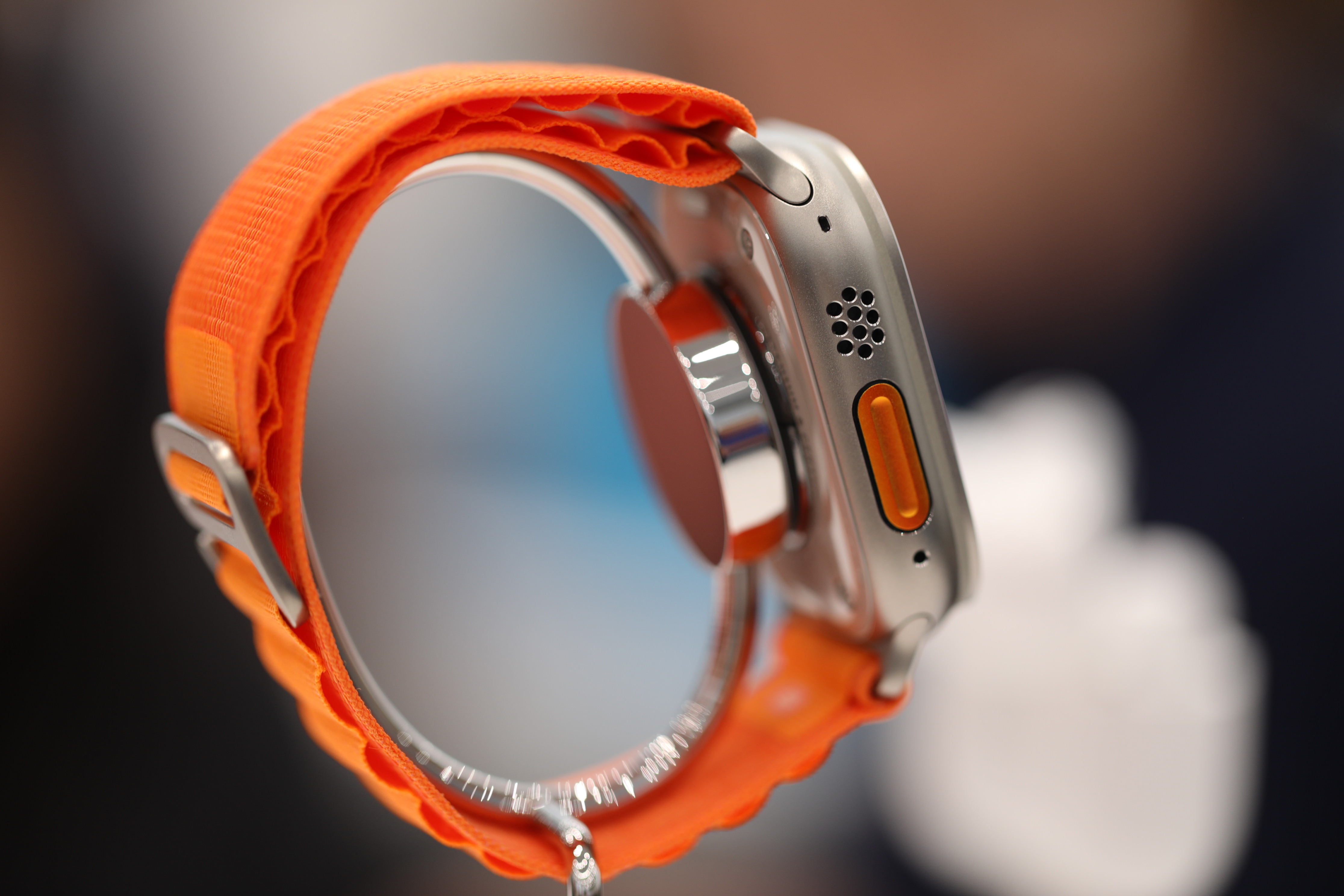
Another is the product’s overwhelming size. The 49mm case is considerably larger than the largest Series 8 (45mm). As is clear from our images, it’s not going to be for every wrist.
So, how worried should Garmin be about the Ultra? Apple certainly isn’t the first manufacturer to come after the outdoor smartwatch throne. Samsung, for instance, has taken its share of shots at the category over the years to varying degrees of success.
What Apple brings to the table, meanwhile, is experience. The company has gotten very good at building smartwatches, both from a hardware and software perspective.
With watchOS 9 as a foundation, the Ultra finds Apple building rugged hardware around a great smartwatch experience, rather than the other way around. Of course, it’s quick to note that the product was built by a team of active people with triathlons and the like under their belt. (And based on many of these features, yes, Apple engineers we can tell you’re triathletes — some you, at least.)
As such, it’s more than just a bigger, more rugged watch with some new apps on board. But does the entire package add up to something hikers, mountain climbers and other extreme athletes should genuinely feel comfortable ditching their Garmins for?
The Apple Watch has good looks and a bevy of features to offer, but we’re not ready to declare Garmin’s robust watch division dead just yet. And not just because of the price.
We know that we’re going to have to do a lot of real-world testing (beyond a few outings) to really answer the question. We’ll be getting the product on hardware writer and certified Scuba instructor Haje’s wrist later this year, when those features roll out. Having not actually laid his hands on the product yet, he did share a few initial thoughts. Top of mind for Haje? The pricing model for the Oceanic app allows a user to unlock diving features on a per day, week or monthly level at a price that is lower than renting a dive watch. So, expensive for a smartwatch, cheap for a dive watch.
That’s an interesting twist, he noted. Stay tuned for a full diving evaluation soon.
In the meantime, we (hardware editor Brian Heater and transportation editor Kirsten Korosec) have put the Ultra through a few tests, including a couple of outdoor adventures and other sports, and are ready to share some of those experiences.
More of everything

Image Credits: Brian Heater / Brian Heater
The big promise of the Apple Watch Ultra is more. It’s right there in the name. More battery. More features. More girth. More ruggedness. Just more.
A lot of this is the kind of ‘more’ that athletes like ultra runners, triathletes, mountaineers, thru hikers, climbers and scuba divers are looking for. But for all of these folks, more is not always the most important thing. As with any smartwatch, functionality and usability are key. A slick exterior is mostly a bonus.
The good news here is that Apple delivers in a lot — but not all — areas of functionality. One big gap is recovery metrics, a big area that Apple should be able to jump into if it wants to attract data-obsessed athletes. For most aspirational Apple Watch Ultra buyers this won’t matter. But those training for ultras, marathons and triathlons, they’ll will want to track rest and recovery beyond those sleep metrics. And there are plenty of hardware makers like Garmin and Oura Ring and apps like Strava that can help.
The various interchangeable digital watch faces are snappy and three new specialized bands are bright and appealing. But where Apple excels with the Ultra is its understanding of how most (but not all) athletes will use this watch.
The appeal for runners is certainly clear — rock climbing, not so much. Mountaineering, possibly. But rock climbing outdoors (especially if one is keen to tackle cracks and off-widths) — and the hand jamming that is often required — a device this size just doesn’t make a lot of sense, even if it is housed in titanium. But hey, rock climbers using watches isn’t really much of a thing at this point.
Size
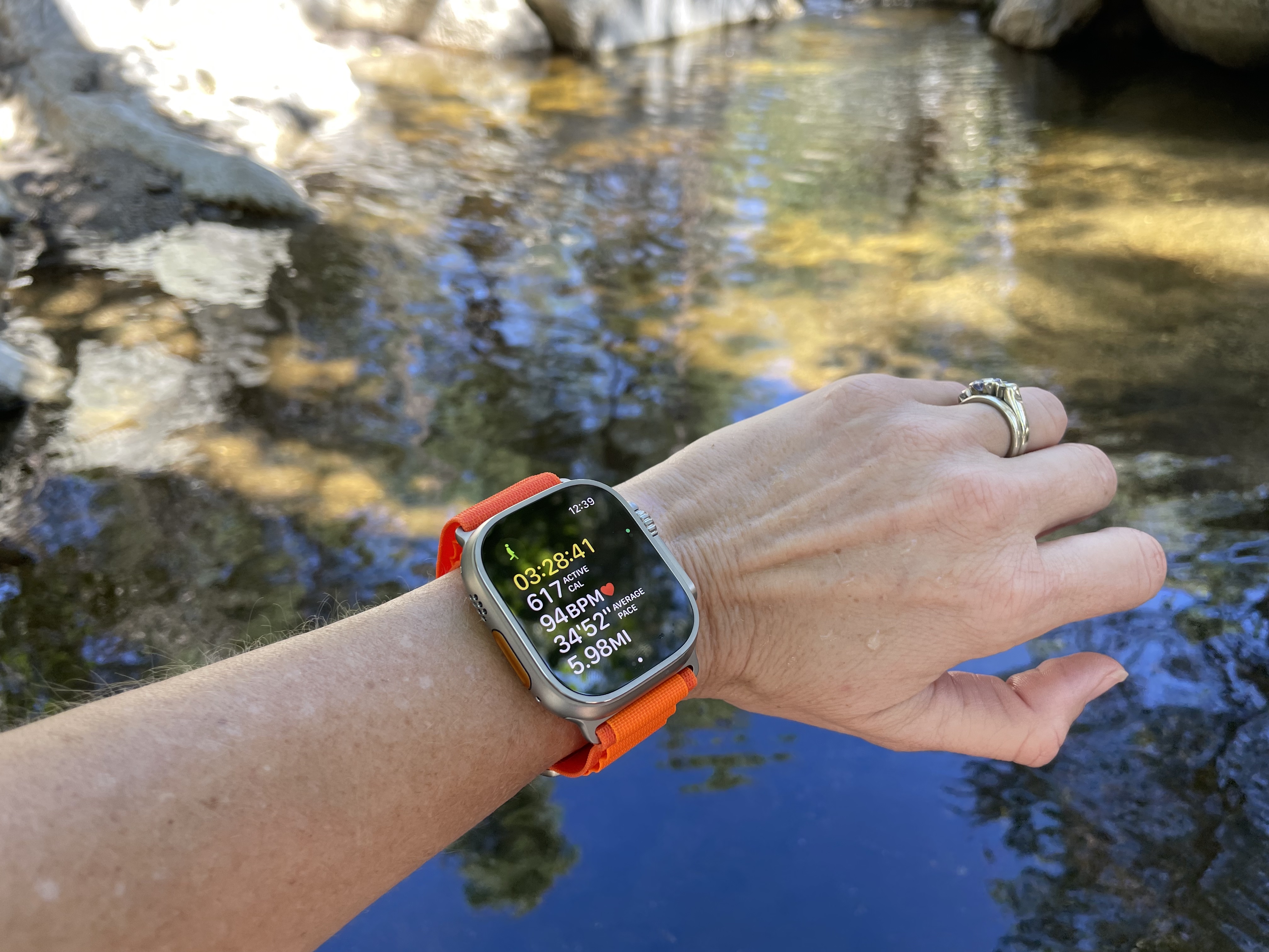
The Ultra is big. Like, really big. It’s going to be too big for some users, full stop. However, with one us having a wrist size of 15 cm (circumference) it feels surprisingly smaller and lighter than it looks. The watch, outfitted in the alpine loop band, was comfortable during a nearly seven-hour outdoor outing, plugging away at the laptop as well as a tennis match.
Apple’s standard rectangular design (as opposed to the circular face of others) ensures that the toggles, wheels or dials don’t cut into your wrist during activity. For instance, the watch does not impede with a forehand or backhand stroke in tennis. We wonder, even though there is a clear triathlete aesthetic in the functionality, how those Ironman participants will deal with this oversized watch while trying to rip off a wetsuit as they scramble to transition to the bike ride.
While the rectangular design is not new for Apple, the shape is even more important as the size of the watch has expanded. The one area we didn’t test was how it might be to sleep with this watch. Stay tuned for our backpacking review because this sucker will stay on the whole time.
While the case is significantly larger than other Apple Watches, the actual display size isn’t a huge jump. It’s bigger than the Series 8 (making it the biggest Apple Watch, the company handily notes), and the standard curved glass has been swapped for a more durable, flat Sapphire panel. It’s also the brightest Apple Watch, clocking in at 2,000 nits to the Series 8 and SE’s 1,000, without taking a significant battery hit.
Action button — yes!
Even before we took the Ultra on a 10.7-mile hike and off-trail canyoneering adventure with 2,850 feet of elevation gain, a bit of rock climbing (scratch that) and even tennis, the Action Button stood out as an immediate improvement and necessary feature for any runner, triathlete or anyone participating in a sport in which you might be in constant motion or wearing gloves.
Mountaineers and skiers are going to recognize the value of a big orange action button on the left side of the watch. Sure, many new gloves come with smartphone-approved pads on the fingers, but they tend to be difficult to use. A big, brightly colored button that can be depressed in one action is what active users want. After using it on the Ultra, it’s easy to imaging the feature coming the standard Watch somewhere down the road.
That said, there’s still a learning curve. The button can be customized to the user’s liking, and while customization is great, it comes with added complexity. Press the big, new crown and tap Settings. From there, you’ll see “Action Button.” Tap that to assign a function, including: workout, stopwatch, setting a compass waypoint, starting a Backtrack path, a dive, turning on a flashlight or creating another shortcut.
We landed on workout. From there, the button can be further customized to a specific activity. Runners might pick “outdoor run,” for instance. The promise of on-the-action is real if the user customizes the action button in advance.
One point of confusion occurred while using the active button that others might find helpful. Pressing the big, orange button once launched the workout, in this scenario. Clicking it again “mark[ed] a segment,” rather than pausing the workout. To do that, the user needs to simultaneously push the orange Action Button on the lower left of the watch and the digital crown. It’s a simple movement and one that avoids the touchscreen.
Marking segments is great for runners, but in feature updates we’d like to customize the secondary action on the “action button.” Another accessible feature worth noting is the siren. By pressing and holding the action button and the silver Side button for several seconds, the user will feel a haptic buzz and then see “siren,” “compass backtrack” and “SOS.”
Its designers may have envisioned SOS and siren as a backcountry feature. It’s loud (but not ear-piercing so outdoors) and pitched in a frequency designed to be heard over long distances. But as one backpacker here will attest, the quick access to those two features is also compelling for runs or walks in the city.
Battery life
The other “more” alluded to earlier is battery life. The feature has been a longstanding albatross around the Apple Watch’s neck, especially as the company has expanded into sleep tracking. The Ultra boasts a stated life of 36 hours — double that of the Series 8. The numbers improve further with the new Low-Power mode and other upcoming features. (For a more detailed breakdown of Low Power Mode, check out the Series 8 review.)
Most of the improved to battery comes as a direct result of the significantly larger casing, coupled with the reduction in size of certain internal elements like the haptic motor. The math is simple: more internal volume = more room for battery. For its part, Garmin offered a cheeky response to the Ultra announcement, noting, “We measure battery life in months. Not hours.”
During the outdoor adventure, we took the watch off its charger at 7AM with a full battery. The action button was deployed to start the workout at 8:30 am PT. For the purposes of testing the battery life, the workout tracking remained on for 6 hours and 43 minutes. After the workout was complete, which was 10.7 miles of on-trail and off-trail movement (the slow rock scrambling canyoneering part), we kept the watch on the wrist just without actively workout tracking. GPS and other actions remained active. The battery lasted for a total of 36.5 hours, including the workout tracking time and other uses. So, mission accomplished there.
Compass and backtrack
One of the features that received a bit more attention here at TechCrunch is the compass and backtrack feature.
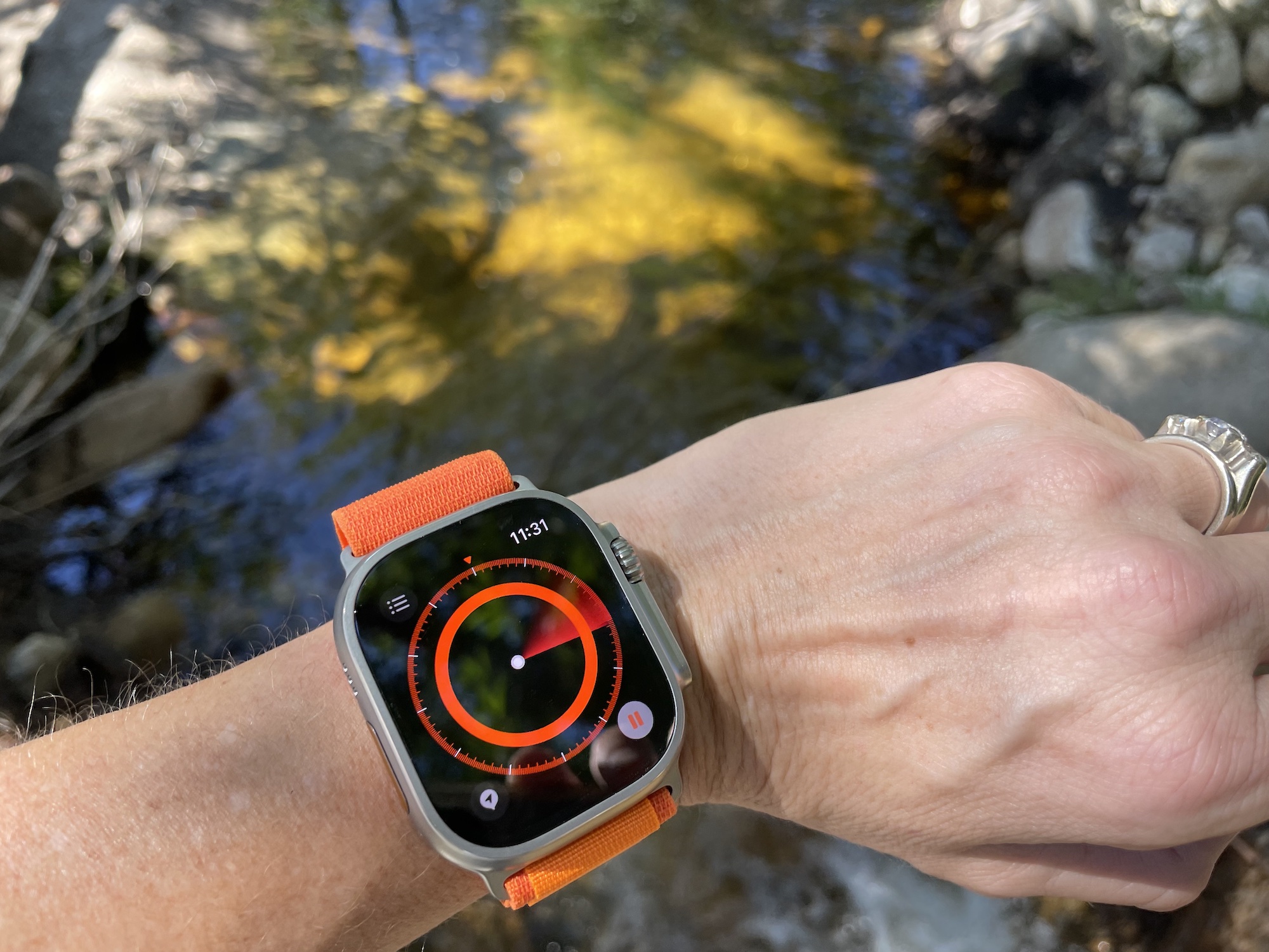
During the outdoor 10.7-mile adventure, we deployed the compass function to test the waypoints and backtrack feature. The compass had trouble calibrating during this initial test. As can be seen in this photo below, the compass is attempting to ramp up, but never does.
During a second and third test, the compass immediately opened up and the feature worked as advertised. Our interest in the compass is really about the backtrack and waypoints feature. This is a feature that will be used by fraction of customers, but we wanted to see how well it works, because when you need it, you really need it.
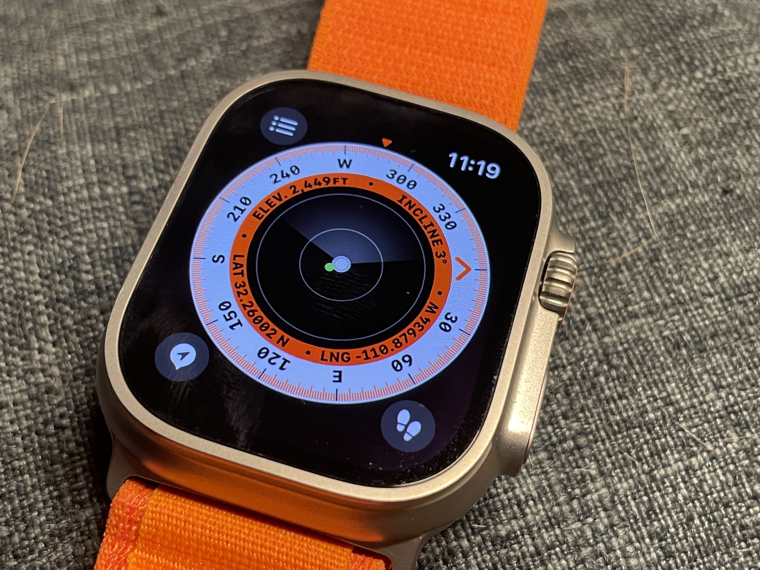
During our outdoor test, in an environment with little to no cellular service, the watch was customized to show the waypoint feature on the face. The elevation, activity level and compass directions were also on the face. By tapping the directions, you’ll surface the compass itself. From here, you have choices.
Most users will always be on a marked trail. But for the few who wander off, like us, you can drop waypoints and then click the backtrack feature to help find your way back to the trail or car or wherever that “ok I know where we are now” spot is.
Users can tap the waypoint icon on the bottom left corner of the Compass app, as shown above. In the second and third tests, we chose to drop waypoints along a run and a walk. Once the waypoint is tapped, a screen pops up to customize. You don’t need to go further, but some may want to note this particular breadcrumb. Perhaps it’s a trail junction or other valuable spot. Whatever it is, you can tap on “label” and give it a name. You can then rotate the digital crown and select a color. From there, you get a chose of symbols, like House and Tent.
The waypoints are in there for good (unless you manually delete later), which means if you ever want to find that waypoint marked “amazing view” you can always go back and find it.
The backtrack function is what makes the waypoint feature shine. It’s those little feet in the bottom right that help you retrace your exact route back to various waypoints you have dropped.
For hikers who head off trail, this may be useful. But again, it’s a going to be a very cool, rarely used feature that some users will love and everyone else will ignore.
In the end, the Ultra is going to be aspirational for many (like the running shoes you plan to take for a spin any day now), and functional for athletes who can use the aid for outdoor adventures. The design is intuitive and beats the pants off other fitness watches in terms of UI, streaming and connectivity. It’s sporty and has sufficient battery to attract loads of customers. But it lacks a couple of features — like recovery metrics and offline topo maps — for those really serious about training or outdoor adventures.
Stay tuned for future updates from both Apple and us. One of the upsides of the smartwatch model is that function can be continually added of the life of the device. We know for sure there are some features over the horizon, including additional battery features and scuba functionality we’re (well, one of us) excited to take for a spin. Other features, like the ability automatically identify when you’re running on an outdoor track (in the U.S. for starters) via Apple Maps data are also coming down the road.
There’s a lot to like here. It won’t replace a trusty Garmin outright for every devoted outdoor enthusiast, but in the end, the Ultra is much more than an Apple Watched dressed up in a rugged case.
Apple Watch Ultra first impressions by Brian Heater originally published on TechCrunch


