Workday, which offers a set of services that helps companies manage people and finances, was one of the earlier enterprise SaaS companies, launching way back in 2005, coming online about six years after Salesforce.
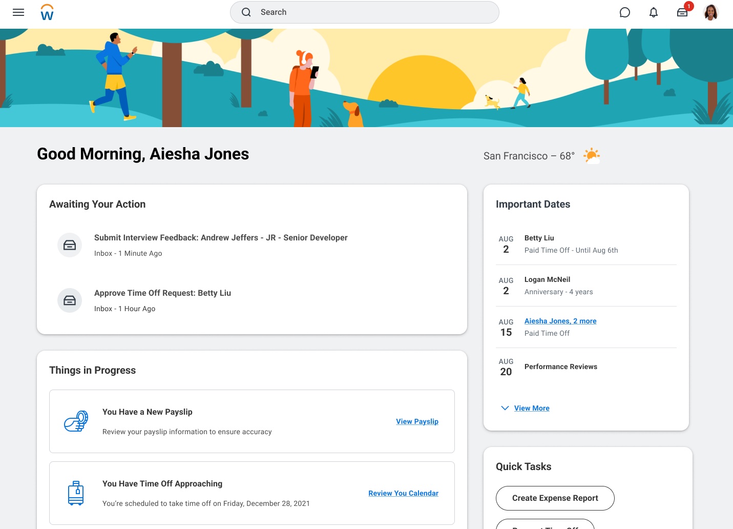
Today, the company announced an interface overhaul across the product line in an attempt to modernize and make it easier to use for everyone from frontline workers to managers to IT.
Writing in a company blog post announcing the UX changes, Workday chief design officer Jeff Gelfus, who has been charged with implementing the design modernization, sees it as simplifying the experience for all users, regardless of their role.
“When it comes to simplifying, our mission is to make Workday feel effortless. For frontline workers, it should be easy to check-in to their shift with a single tap on their mobile phone, and managers should be able to approve an expense report quickly from their natural workspace without interrupting their flow of work,” he wrote.
“Power users should be able to have a hub of all the capabilities they need all in one place. For all these user types, they should be able to find information, easily and intuitively, when completing complex tasks.”
Over time this kind of redesign has come to mean delivering a more consumer-like experience, something that doesn’t look or feel like a clunky enterprise application, but rather one that looks like something you’re used to using in your personal life on your phone or tablet.
“We expect that [consumer experience] in the enterprise now as well…It’s just table stakes really for any application. And so that’s the way that we’re focusing on enabling that employee experience. It is that consumer grade UX within [our] enterprise applications,” company CTO Jim Stratton told TechCrunch.
That includes delivering an experience based on your job role, rather than having a one-size-fits-all interface. “We’re focusing on [job roles] as unique personas and having different experiences surfaced up to those individuals, those different personas, depending on where they are and what they’re doing,” he said.

New personalized Workday start page. Image Credits: Workday (Image has been cropped)
Stratton says that beyond making it easier for users to do their work, as part of an enterprise software ecosystem, it has to be open and extensible as well. “So the rest of our job is to enable a company to extend that platform for all the custom things that they do around their people and finance, but then also to be open and connected to those other systems that they need to run their business,” he said.
An example of how Workday has connected to other systems, even before this change, is its integration in Slack. Instead of requesting a day off in the Workday application, an employee can make the request in Slack and the request is routed automatically to a manager in Slack, who can quickly approve it.
There are two ways to build applications on top of Workday. The first is Workday Extend, an approach that has been around for some time, although there are improvements to it in the new version. Stratton says this is a tool that’s designed for IT and developers to build applications that meet the needs of an individual company.
The new way, which is called Workday App Builder, is a low code tool aimed at line of business users. “App Builder is a move towards low code, no code to enable business users to actually build those applications themselves. So rather than relying on a developer or someone in their IT shop, the actual business users will be able to develop those themselves,” Stratton said.
All of this and more is being introduced today at Workday Rising, the company’s customer conference, taking place this week in Orlando.
Workday turns more modern and personalized with new interface makeover by Ron Miller originally published on TechCrunch

